Two teams can order the exact same cap and end up with completely different-looking hats, because the decoration method matters as much as the blank underneath it. A stitched crest reads as classic and permanent; a full-color transfer reads as modern and sharp; a raised puff logo reads as loud and athletic. For a youth baseball team, picking the right method is mostly about three things: how detailed the logo is, how many colors it uses, and whether the cap front is structured or soft. Get those to line up and the hat looks like it cost more than it did.
Here is how the common methods actually differ, with the tradeoffs that matter when you are buying for a roster rather than a single hat.
Flat embroidery: the team-hat default
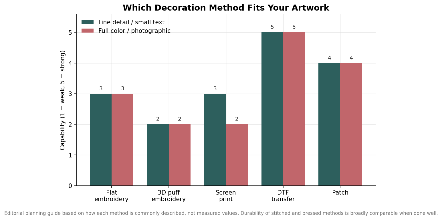
Flat embroidery stitches thread directly into the cap panel, and it is the default for a reason. Because the color lives in the thread rather than sitting on top of the fabric, it does not crack, peel, or fade the way a surface print eventually can, which is exactly what you want on a hat that gets sweated in and tossed in a bag all season. It carries a clean team monogram or a simple mascot well. Where it struggles is fine detail: thin lines, gradients, and small lettering below roughly a quarter inch tend to fill in or lose legibility once they are converted into stitches. If your logo has tiny text or delicate linework, plan to simplify it for thread or choose a method built for detail.
3D puff embroidery: bold, raised, and simple
Puff embroidery lays a thin foam under the stitching so the design stands up off the crown. It gives a bold, varsity look that photographs well on a structured front, which is why it is so common on trucker and fitted caps. The catch is that puff is even less forgiving of detail than flat embroidery. It shines on thick block letters, a single initial, or a chunky logo shape, and it fights you on anything with small elements or more than two or three colors. Think of it as a way to make a simple design louder, not a way to reproduce a complicated one.
Screen print and DTF transfers
Surface methods put ink or a printed film onto the cap instead of stitching into it. Screen printing is economical once you are ordering in volume because the setup cost spreads across the run, but it wants a flat front panel, tops out around a four-inch design area, and works best at two to three colors; each added color raises setup cost. It also dislikes the center seam on a standard six-panel cap, so it pairs better with flat-front or five-panel styles. DTF (direct-to-film) transfers solve the color problem outright: they reproduce unlimited colors and photographic detail with no per-color setup and no real minimum, which makes them ideal for a small team order with a complex, multicolor logo. The tradeoff is that a transfer sits on the surface and can wear at seam lines over time, so it is a better fit for a one-season team hat than a decade-long uniform piece.
Patches: woven, rubber, and leather
A patch decorates a separate piece and then bonds it to the cap, usually by heat press or stitching. This is how you get texture the base cap cannot: a woven patch captures finer detail and small text better than direct embroidery, a rubber or PVC patch gives a modern raised matte look, and a leather patch reads premium on a trucker or dad cap. Patches also let you keep one consistent logo across several different hat styles, since the decorated element is identical regardless of what it is pressed onto. Pricing generally sits in the same premium range as embroidery. The main limitation is flexibility: the patch shape and size are set before it touches the hat, so it is less suited to wrapping a design around the crown.
Matching the method to the cap and the roster
The decoration only looks as good as the blank it sits on, so choose them together. The cap models offered here span structured and soft options, from the trucker-style Richardson 112 to several OTTO five- and six-panel profiles, plus Valucap and Sportsman styles, in size ranges from youth-friendly one-size options up through XS to 4XL, in team colorways like black, navy, royal, kelly, maroon, charcoal, khaki, and grey. That range matters because it determines your options: a structured trucker front is the natural home for 3D puff or a rubber patch, while a flat-front or five-panel cap opens up clean screen printing, and any of them take flat embroidery well.
The chart above shows how much the color and size selection varies between blanks, which is worth checking before you fall in love with a specific hat, especially if your team colors are unusual or you need a wide spread of youth and adult sizes. As a rule of thumb for a youth team: a simple one or two-color team mark goes on almost anything with flat embroidery and lasts; a bold single logo pops in puff on a structured cap; a detailed, multicolor, or photographic design belongs on a DTF transfer or a woven patch. Decide the logo’s complexity first, let that pick the method, and let the method point you at the right cap, rather than the other way around.